
As you might know, there is a technical side to lighting and then there is a design perspective. Surprisingly, while you’ll be able to find a ton of info on the technical aspects of lighting (like inverse square law, light spill, color rendering index, flash duration and whatnot) you won’t actually find a lot of help with regard to the design principles of lighting in photography. Let’s try and do something about that for once :).
Most of what I know in visual design comes from the simple process of observation and analysis. If I like an image, I store it, taking a screenshot or a quick iPhone snap. Every couple of weeks I browse through my new discoveries and make notes about them, specifically what it is in each image that…
- … grabs my attention
- … creates the unique mood of the picture
- … I find appealing
- … makes me feel and think
Over the years this process has yielded its fruits and led to my own thought processes and my approach to lighting. The following four basic design principles of photographic lighting will help you to become more deliberate in your light design process too.
Lighting the Hero
Concept, composition and lighting should always work in concert. And the first step in making sure they do, is “lighting the hero”, lighting that which is most essential in your story and composition.
So what is the area in your image where you want your viewers’ eyes to jump to first? This areas need to be lit, it’s that simple! Everything else in the image is secondary and has to be adjusted to allow for these focal points to be lit correctly. Apart from that “hero” there might be a couple of side kicks as well, if we abuse this analogy a little further. In lighting these sidekicks, just make sure they don’t dominate the image.
When I say “light the hero” I don’t actually mean, bathe your main subject in full body light from all sides! It’s about lighting the essential: his facial expression, maybe something he holds in his hand, etc.. The hero doesn’t even have to be a person at all. It could just as well be an object that is central to the story of your image.
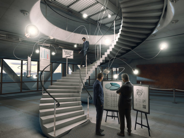
The important part is that our eyes are drawn to the brightest area of the image. But apart from that, our eyes also like to follow along lines. Lines guide us comfortably around the image, they give the image stability and depth. As the person who sets up the lights, you can intentionally create them! An example would be the light pattern on the wall from a window or the edge of a shadow.

Lighting for Shape and Texture
Try to find a light angle that lets you best define the shape of an object (or subject). If things look too flat, move the light more to the side. The same is true for texture. Shadows are a very important part of perceived texture. So again, frontal lighting isn’t helping your texture. You also lose texture detail in the blown out highlights and in the deep shadows. I’m not saying that’s always a bad thing. But if you care for the detail in these areas, pay close attention to your power settings on your kicker and fill light.
A couple of years back I tried to figure out what draws me to an image from a visual perspective. It occurred to me that I seem to be attracted to dramatic and gradated lighting. Meaning, whenever I see a surface that’s lit evenly (flat), my brain rejects the image as boring. Knowing that, I try to create gradation wherever possible and it’s actually something I’ve seen being done by the great masters as well. For round objects/subjects this is not too hard, but for flat surfaces it can become a technical challenge.

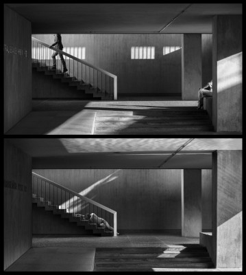
Lighting for Separation
If you’ve ever read an article of me, you probably already know that separation is my favorite thing to blab about in photography. Maybe it’s because I understood the concept only a couple of years after starting with photography, as a kind of secret recipe that all grand masters lived by. Or maybe it’s because it’s so simple to explain, but so incredibly hard to master.
You create separation between object and background, if their tonal values contrast with each other – especially on the actual edge of the object. When there is not separation, object and background collapse and our visual system is confused. However IF there is separation, the object will pop off the background – it becomes almost 3-dimensional to the viewer.
Always make sure your main object or subject is well separated from the background (unless your concept demands otherwise, but that’s rather rare…). But of course this does not just apply to lighting: Also look out for separation in things like jewelry, clothes, props, etc.
Motivated Lighting
The light hitting an object looks believable only if we either see the light source or get other clues from the image about the whereabouts of the light source. This is called “motivated lighting”. Simply flashing a model from a side somewhere off-screen can feel jarring to the viewer. Remember we at least subconsciously always try to make sense of what we see and if light is coming from an unnatural (and unexplained) angle, we reject the image.
The trouble with putting your actual light source within the frame is obvious: Photographic light stands/flashes/softboxes are pretty unattractive. But what might be even worse is the fact that they are much too bright. It’s like exposing for a daylight landscape but then shooting a photo of the sun itself with the same exposure settings! So setting up a “practical light” (a make-belief light source) always involves a little bit of trickery. I usually shoot the practical lights separately and then blend them in with the other parts of the image. Like this their own light color doesn’t “pollute” the lighting of the rest of the scene. And yes, you have to actually light the practical light source, at least with fill light.


Excellent, informative information
Excellent piece of information about light and lighting
. You are amazing in putting forward your thoughts . Thank you so much .